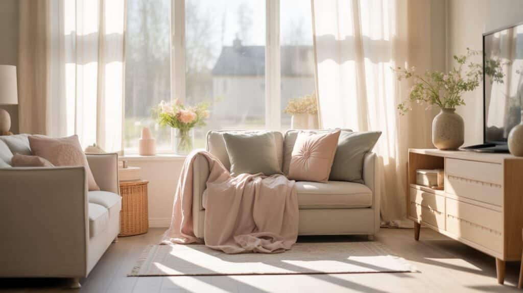
A Gentle Spring Reset 🌸
There’s something about spring that makes me want to throw open the windows, let the light pour in, and quietly rethink how my home feels. Not redecorate everything. Not buy a whole new sofa. Just… soften things. Lighten things. Choose calm on purpose.
Colour plays a bigger role in that than we realise. The right shades can make a space feel peaceful, uplifting, and easy to live in. The wrong ones can feel busy, heavy, or just a bit meh. And honestly, at this stage of life, I’m only interested in colours that make my home feel happy and supportive, not stressful.
That’s why I’ve pulled together these five fresh spring colour palettes for a calm, happy home. Each one is soft, liveable, and designed to bring in that spring feeling without overwhelming your space. No loud trends. No cold minimalism. Just beautiful colours that work together effortlessly.
For each palette, I’ve included a simple colour chart you can save, screenshot, or use as inspiration when you’re updating a room, choosing accessories, or planning a gentle spring refresh. Think of this as your permission slip to choose calm, choose joy, and create a home that feels really good to be in this season 💕
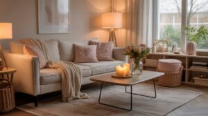
Palette 1: Soft Neutrals With a Spring Glow
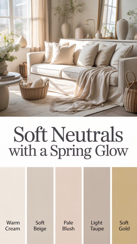
Vibe: Calm, airy, timeless
If you love a light, peaceful home but still want it to feel warm and welcoming, this palette is your girl. Soft neutrals are having a very quiet glow-up this spring, and honestly, I am here for it. This isn’t about stark whites or flat beige. It’s about gentle layers that feel soothing, feminine, and easy to live with.
This palette creates a calm foundation that instantly makes a space feel lighter and more relaxed. It’s perfect if you want your home to feel serene without stripping away personality. Think soft mornings, sunlight on the walls, and that deep exhale when you walk into the room.
Colour Chart:
- Warm cream
- Soft beige
- Pale blush
- Light taupe
- Subtle gold accent
Use this palette as a base rather than a statement. These colours work beautifully together and make everything else in your home look more intentional.
Where it works best:
- Living rooms where you want to unwind
- Bedrooms that feel soft and restful
- Open spaces that need warmth without heaviness
Style it like this:
- Layer textures like linen, boucle, and soft knits to add depth
- Choose ceramics, baskets, and natural wood for warmth
- Add small gold or brass details for a gentle spring glow
This is the kind of palette that never shouts, but always feels good. Calm, happy, and quietly confident, just how a home should feel ✨
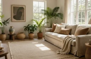
Palette 2: Sage Green and Soft Earth Tones
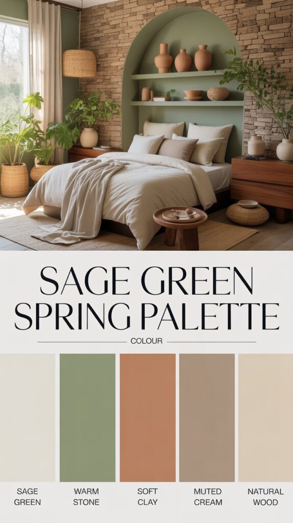
Vibe: Grounded, peaceful, naturally calming
This palette is for those moments when you want your home to feel like a deep breath. Sage green has that magical ability to calm the nervous system while still feeling fresh and alive, which makes it perfect for spring. Paired with soft earth tones, it creates a space that feels balanced, nurturing, and quietly beautiful.
There’s something very reassuring about these colours. They bring the outside in without going full woodland retreat. It’s calm without being dull, and fresh without feeling cold. Basically, it’s nature, but make it cozy and grown-up.
Colour Chart:
- Sage green
- Warm stone
- Soft clay
- Muted cream
- Natural wood tone
This palette works especially well if you want your home to feel steady and grounded while still embracing that lighter spring energy.
Where it works best:
- Bedrooms where rest and relaxation come first
- Kitchens that feel welcoming and lived-in
- Reading corners or quiet spaces
Style it like this:
- Add plants or botanical prints to echo the green tones
- Choose matte finishes over shiny ones for a softer feel
- Mix in handmade or imperfect textures like pottery or woven baskets
If calm had a colour palette, this would be it. Soft, earthy, and effortlessly soothing, it’s the kind of home energy that just feels right 🌿
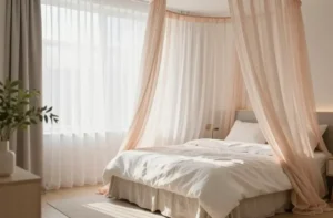
Palette 3: Soft Blue With Warm Neutrals
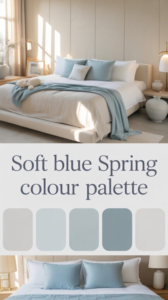
Vibe: Serene, light, quietly happy
This palette is proof that blue doesn’t have to feel cold or coastal to be calming. When you pair a soft, airy blue with warm neutrals, something really lovely happens. The space feels peaceful, balanced, and instantly more breathable. Like the moment you step outside on a clear spring morning and everything feels a little bit easier.
Soft blue brings a sense of calm and clarity, while warm whites and sandy tones keep it from tipping into chilly territory. It’s gentle, grown-up, and perfect if you want your home to feel serene without losing that cozy, welcoming energy.
Colour Chart:
- Soft sky blue
- Warm white
- Pale sand
- Light grey
- Brushed brass accent
This is a beautiful palette if you’re craving calm but still want your space to feel light, bright, and uplifting.
Where it works best:
- Bedrooms that feel peaceful and restorative
- Bathrooms where you want a spa-like vibe
- Home offices that support focus without stress
Style it like this:
- Let natural light do the heavy lifting
- Balance blue with warm textures like wood, linen, and wool
- Add brass or soft metallic accents for warmth and polish
This palette is all about ease. Calm, gentle, and quietly joyful, it creates a home that feels like a soft exhale every time you walk in 💙✨
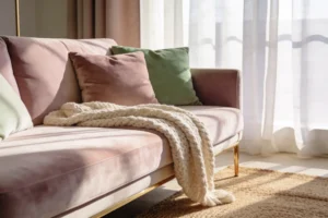
Palette 4: Muted Pastels That Feel Grown-Up
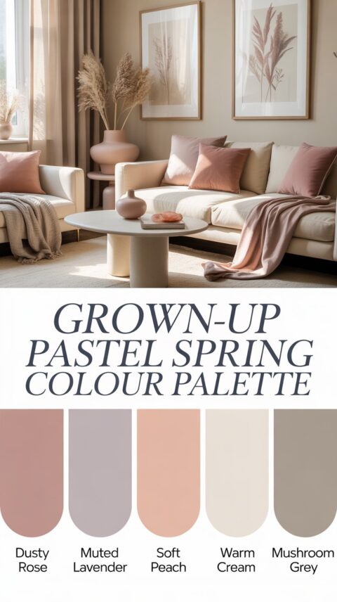
Vibe: Joyful, feminine, soft but sophisticated
Pastels get a bad reputation for being a bit too sweet, but when they’re muted and thoughtfully paired, they become surprisingly calming and very chic. This palette is all about softness without the sugar rush. It brings gentle colour into your home while still feeling relaxed, elegant, and completely grown-up.
These shades add a quiet sense of joy to a space. Nothing loud. Nothing shouty. Just soft colour that lifts the mood and makes a room feel more personal. If you love a feminine touch but still want calm and balance, this palette is a dream.
Colour Chart:
- Dusty rose
- Muted lavender
- Soft peach
- Warm cream
- Light mushroom grey
This palette works beautifully when you want to introduce colour in a way that feels intentional and easy to live with.
Where it works best:
- Living rooms that need a hint of personality
- Bedrooms that feel gentle and comforting
- Creative spaces where you want inspiration without overwhelm
Style it like this:
- Use pastels in small doses rather than everywhere at once
- Anchor the softer colours with warm neutrals
- Add texture through cushions, throws, artwork, or ceramics
This is pastel energy for women who know what they like. Soft, joyful, and quietly confident, it brings just the right amount of spring happiness into your home 🌷
Palette 5: Fresh White With Warm Spring Accents
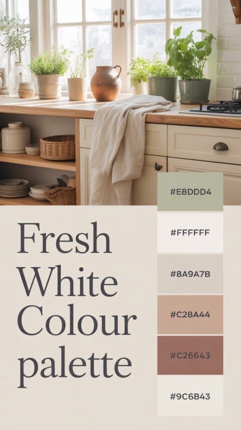
Vibe: Clean, uplifting, effortless
If you love that bright, fresh feeling but don’t want your home to feel cold or clinical, this palette is the answer. White becomes something really special when it’s softened with warm spring accents. It feels light, calm, and quietly joyful, like a home that’s been gently reset rather than completely redone.
This palette is perfect if you’re craving clarity and ease. It creates space to breathe, think, and relax, while still feeling warm and lived-in. Think fresh starts, sunlit rooms, and a home that feels instantly more peaceful.
Colour Chart:
- Soft white
- Warm beige
- Olive green
- Terracotta
- Natural wood
White does the heavy lifting here, while the warmer accents bring depth and character. The result is a space that feels intentional without trying too hard.
Where it works best:
- Whole-home spring refreshes
- Kitchens and dining spaces that feel bright and welcoming
- Smaller rooms that benefit from light and openness
Style it like this:
- Mix old and new pieces to keep the space from feeling flat
- Layer in warmth through wood, ceramics, and natural fibres
- Use accent colours sparingly for a calm, balanced look
This palette is fresh without being stark, minimal without being boring, and perfect for welcoming spring in a way that feels calm, happy, and very you 🤍✨
A Calm, Happy Home Starts With How You Want to Feel
Spring isn’t about changing everything. It’s about choosing what feels good and letting go of what doesn’t. A calm, happy home doesn’t come from chasing trends or buying all the things. It comes from being intentional with the colours, textures, and energy you surround yourself with every day.
Whether you’re drawn to soft neutrals, grounding greens, gentle blues, or a touch of grown-up pastel, the right colour palette can completely shift how your home feels. And the best part? You don’t have to do it all at once. One room. One corner. One small change is more than enough.
Save the palette that speaks to you, trust your instincts, and let your home evolve with you this spring. Calm is a choice. Joy is a choice. And your space gets to support both 💕